

Read your results
How to read the model-health verdict, return by channel, response curves, and what drove your KPI, with the right amount of trust.
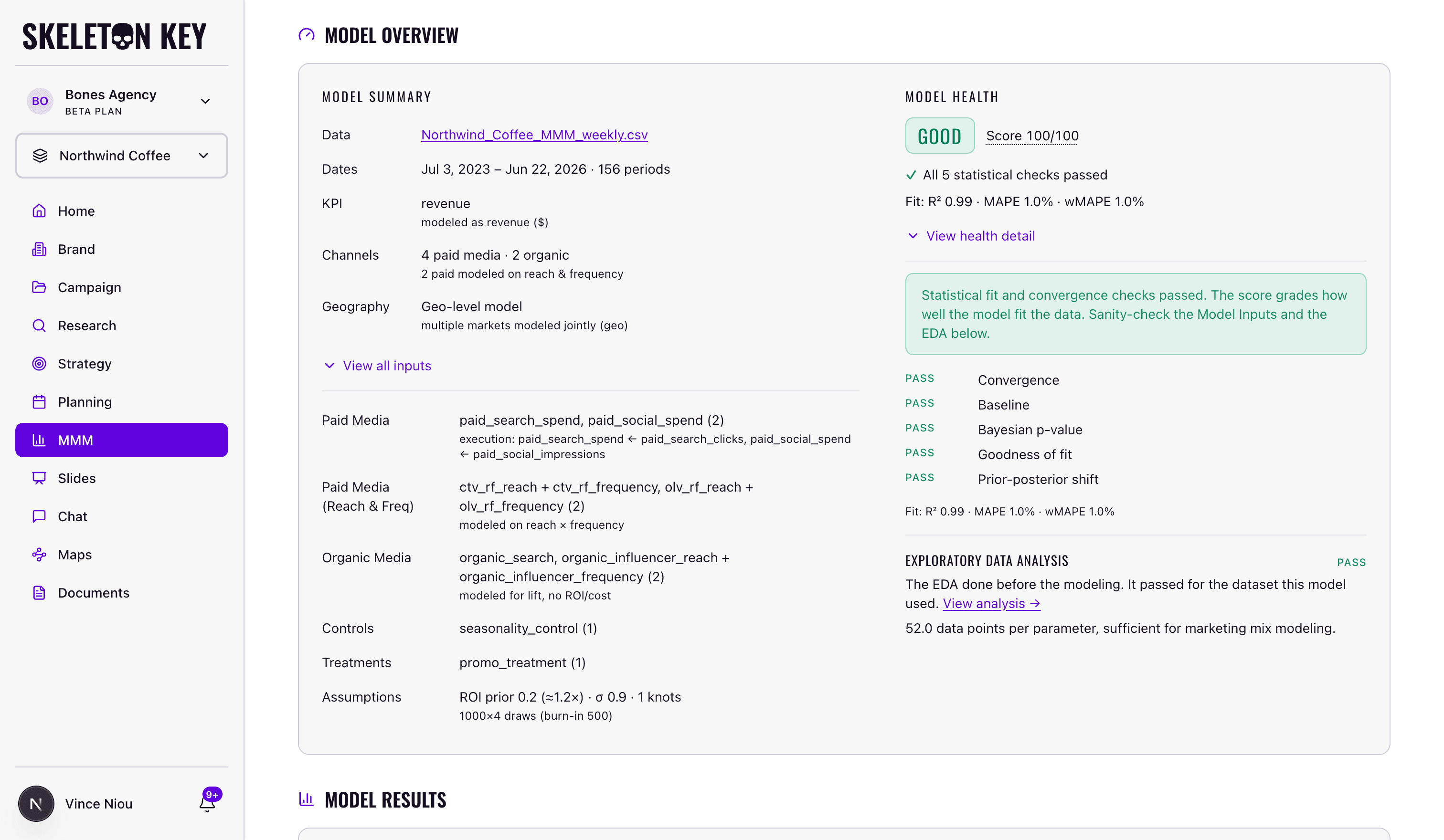
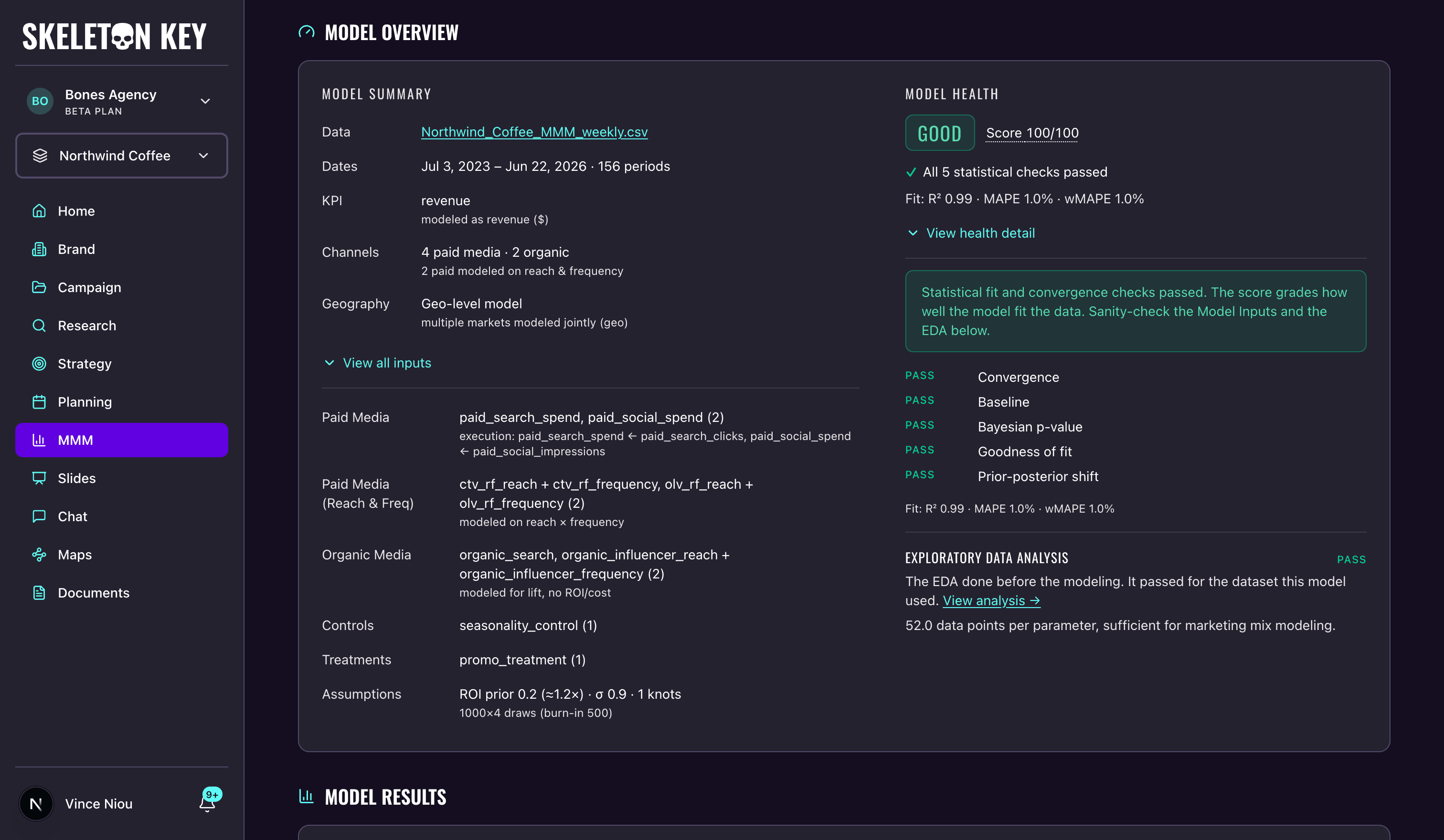
A finished run gives you a page of charts. Before you read any of them, read the verdict at the top. It tells you how much weight the rest of the numbers can carry.
Is the MMM output trustworthy?
The Model health verdict sits in the Model Overview card at the top of the results page, and it's the first thing to read. It rolls Meridian's quality checks into a single verdict (Good, Caveats, or Failed) so you know how much weight the rest of the page can carry before you study a single chart. A healthy model also carries a quality score out of 100. A failed model shows no score: any check failing outright fails the whole verdict, and a score on a model you shouldn't rely on would only invite relying on it.
Open View health detail to see the checks behind the verdict, each marked pass, review, or fail: whether the model converged (Meridian samples the model several independent times, and if those runs don't settle on the same answer, nothing downstream is stable), whether the baseline stays plausible (media shouldn't be credited so heavily that sales without marketing look impossible), whether the model's fit reproduces your actual history (a statistical test plus a plain goodness-of-fit read), whether your data was strong enough to move the assumptions you started with, and whether each channel's return stays consistent with the priors you set. A separate Diagnostics panel lists the convergence statistics for each parameter (R-hat and ESS) if you want to dig in.
What the verdict means for you:
- Good — the checks passed. The numbers are safe to present, after a sanity check of your inputs and the data check.
- Caveats — some checks want a second look. Find which ones in the health detail, and read them before you present.
- Failed — a check failed outright, most often convergence. Don't rely on the numbers. A completed model never re-runs; the path forward is a new model with adjusted data, column mapping, or fit settings (more draws, a wider prior).
Lead with the verbal verdict when you talk to stakeholders; the score is a summary, not a grade to defend. And read health alongside the data check from the prepare-data step: a run can pass health and still be directional if you fed it a short history or thin spend variation, so a healthy score on weak data is directional at best.
Return by channel
The ROI by channel chart shows what each channel returned, as a range rather than a single figure. The range is a credible interval: wider whiskers mean more uncertainty about that channel. For returns measured in dollars, when the low end of a channel's range sits below 1.0, the model isn't certain the channel paid for itself; that's a signal to dig in, not a verdict that it lost money.
How the return is expressed depends on the KPI you mapped. A revenue KPI reads as return on spend: a median of 3.2 means $3.20 back per dollar. A count KPI with a unit value reads the same way, priced by your estimate of what one outcome is worth. A count KPI without one reads as Incremental impact by channel instead: outcomes per dollar, like 0.8 signups per dollar spent. For the reverse view, cost per outcome, download the Technical report (Meridian's own output), which charts CPIK for each channel.
Two flavors of return matter. Average ROI is the return across all the spend a channel has had. Marginal ROI is the return on the next dollar at your current spend level, and it's the one that informs where to move budget. The ROI vs marginal ROI chart plots both (for a count KPI it appears as Efficiency vs marginal efficiency); a channel below the diagonal is saturating, returning less on new spend than it has historically.
On a multi-region run, a Geo performance chart sits below the ROI charts, showing each region's blended return alongside its share of spend and of the results, for the top five regions by paid spend.
Diminishing returns
The Response curves chart plots the incremental outcome each channel drives against its spend. Every curve bends: past a point, each extra dollar returns less than the last. The marker on each curve is your current spend, so you can see how much room a channel has before it flattens. Be cautious reading far to the right of that marker. The part of the curve beyond your observed spend is the model extrapolating into territory it has no data for.
What drove your results
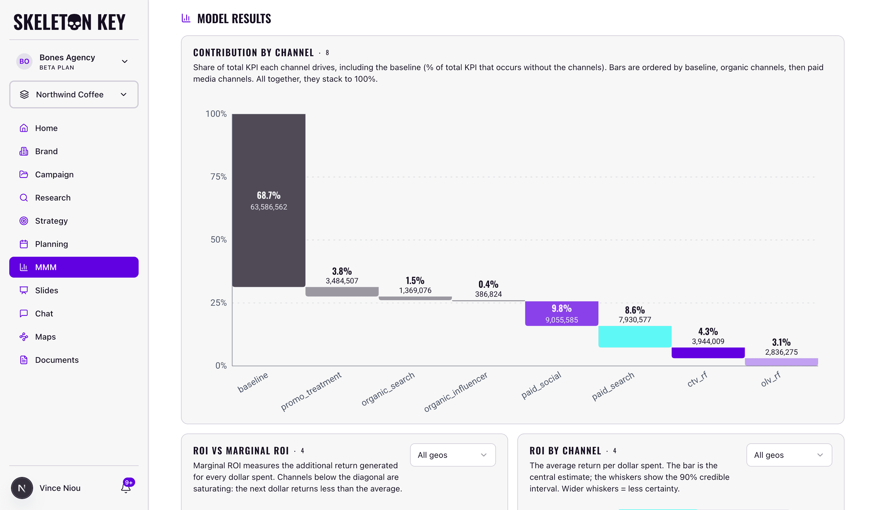
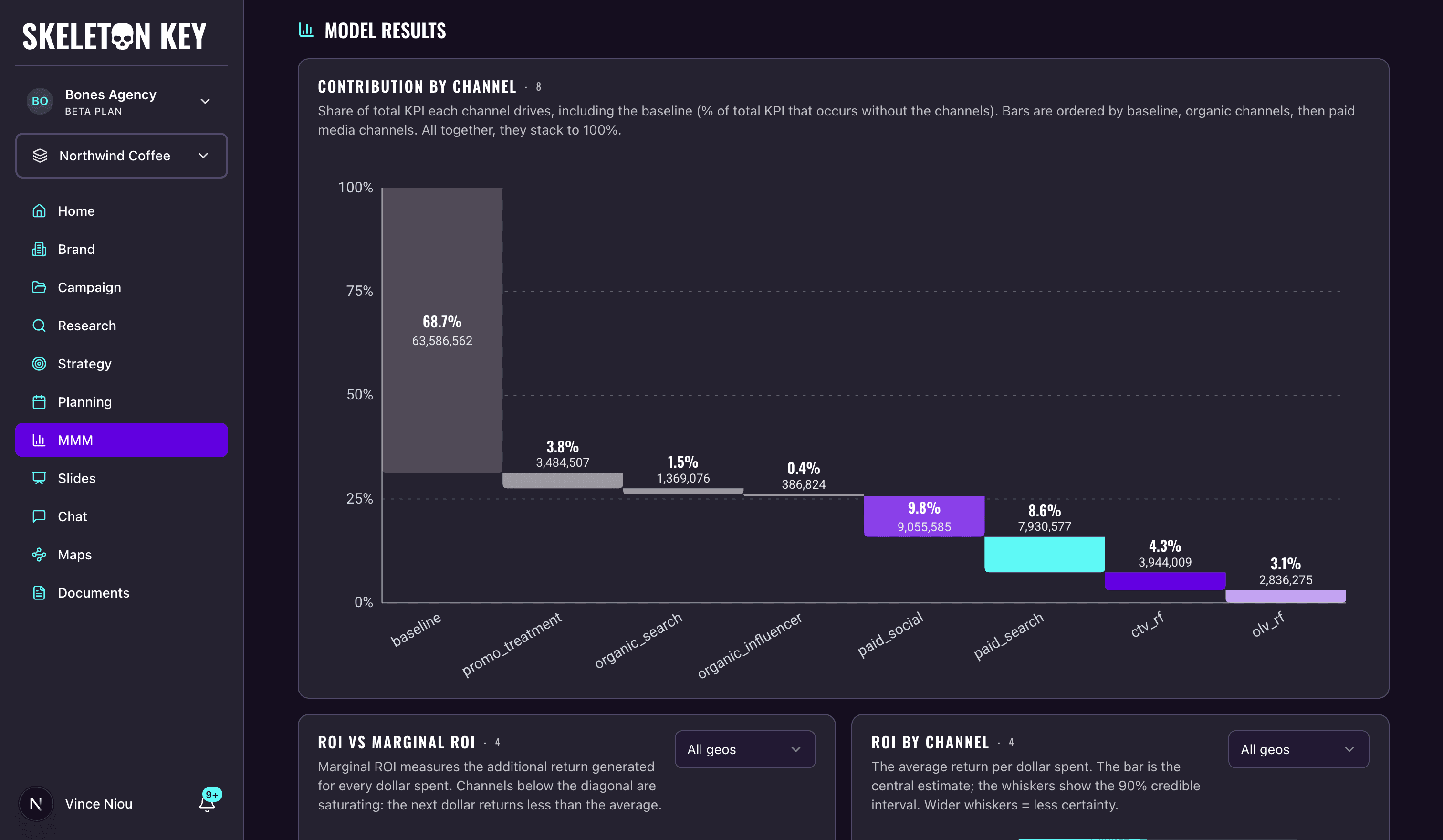
The Contribution by channel breakdown splits your KPI into the baseline and the share each channel drove. The baseline is what you'd have earned with no marketing at all, and it's usually the largest slice. A large baseline slice is normal and does not mean the model thinks your marketing barely matters; it means most businesses have substantial organic demand, and media drives the rest on top of it. The Contribution over time chart shows the same split across your history, so you can see how each channel's contribution moved. Next to it, the Fitted vs actual chart plots the model's predicted KPI over your real history, with the baseline drawn underneath, so you can see where the model tracks your results and where it misses.
Adstock decay
The Adstock decay chart shows how long a channel's advertising keeps working after the period it ran in. A channel like TV typically keeps influencing your KPI for several periods; paid search fades fast. A "period" here is your data's time grain, so on a weekly file each step is a week. This is what justifies crediting a channel for results that land after the spend stops.
Optimal frequency
If you mapped reach and frequency channels, an Optimal frequency chart appears for each one. It shows the weekly average frequency where the channel's return on spend peaks, alongside where your frequency currently sits. If your current frequency is past the optimal point, you're paying to show the same people the ad more times than helps. This chart only appears when reach/frequency channels were part of the run.
Saving and sharing
When the run finishes, the Download menu offers three formats. PDF Document captures the report as you see it, charts included, with whatever region filters you've set. Markdown File exports the numbers as plain-text tables (returns by channel, health checks, fit metrics, diagnostics) for pasting into a doc or handing to another tool. Technical report (HTML) is Meridian's own report: the complete set of native charts and diagnostics in a standalone file you can open in a browser. On older runs where that file wasn't generated, the option is disabled.
Open in New Tab opens the same report as a clean read-only page you can share with anyone who has access to the brand; the Exports & sharing reference covers both in more detail. The result is also saved as a brand document, so you can return to it, or attach it to a Strategy run to ground the Goals and Media Strategists in what the model measured.
Limits and considerations
- The model knows only what you gave it. It can't see a competitor's launch or a supply problem unless you included a column for it, so caveat the results with the context the model couldn't have.
- The numbers are diagnostic, not prescriptive. They tell you which channels are working and where returns are thinning; deciding the budget is still your call, informed by the marginal ROI and the response curves.
For definitions of any term on the results page, see the glossary, or open the Glossary panel at the bottom of the results page.
Last updated: 2026-07-12